- Počet strán: 640
- Väzba: tvrdá
- EAN: 9783836525091
- Jazyk: anglický
- ISBN: 978-3-83-652509-1
- Dátum vydania: 15. júna 2011
- Vydavateľstvo : Taschen
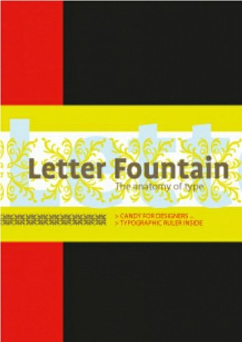
Letter Fountain
Joep Pohlen
This title deals with the anatomy of type. It offers everything you could ever want to know about printing letters and numbers. Looking back as far as man's first efforts to communicate with visual signs and drawings, "Letterfountain" is a completely
unique typeface handbook: in addition to examining the form and anatomy of every letter in the alphabet (as well as punctuation marks and special characters), the book cross-references type designs with important works of art and art movements from
Gutenberg's times until today. Further attention is given to the esthetics of the digital age and typographical recommendations such as the choice of the right typeface for a job. Rounding out the guide are an in-depth comparison between sans-serif a
nd serif typefaces, an essay about measuring systems and indications, advice about typographic rules, plus a manual for developing digital fonts. Over 150 typefaces, their origins, and font characteristics are discussed in detail, visually explained
by full page tables including scale, weight, and slope increments. The extensive appendix contains a general index, one on typefaces (more than 300 are depicted in the book), an index on over 250 type designers, an exhaustive index on type founders f
rom Gutenberg to present, a graphical dictionary, and a bibliography for further reading. The original Dutch edition "Letterfontein" received a Certificate for Typographic Excellence from Type Directors Club New York (TDC) in 2010, and a red-dot desi
gn award from the Design Zentrum Nordrhein-Westfalen, Germany. This title is thoroughly hardbound in half linen with three ribbon bookmarks. It includes 144 pages appendix with resourceful glossary and indices. It has convenient typographic ruler wit
h conversions between four measurement systems and hidden shortcuts for your Apple keyboard! Editor and author: Joep Pohlen and Geert Setola are graphic designers, both devoted with heart and soul to professional typography. Joep Pohlen founded Dutch
Fontana Publishers in 1994, and has won several awards with different works on typeface and book design.
- Počet strán: 640
- Väzba: tvrdá
- EAN: 9783836525091
- Jazyk: anglický
- ISBN: 978-3-83-652509-1
- Dátum vydania: 15. júna 2011
- Vydavateľstvo : Taschen
This title deals with the anatomy of type. It offers everything you could ever want to know about printing letters and numbers. Looking back as far as man's first efforts to communicate with visual signs and drawings, "Letterfountain" is a completely
unique typeface handbook: in addition to examining the form and anatomy of every letter in the alphabet (as well as punctuation marks and special characters), the book cross-references type designs with important works of art and art movements from
Gutenberg's times until today. Further attention is given to the esthetics of the digital age and typographical recommendations such as the choice of the right typeface for a job. Rounding out the guide are an in-depth comparison between sans-serif a
nd serif typefaces, an essay about measuring systems and indications, advice about typographic rules, plus a manual for developing digital fonts. Over 150 typefaces, their origins, and font characteristics are discussed in detail, visually explained
by full page tables including scale, weight, and slope increments. The extensive appendix contains a general index, one on typefaces (more than 300 are depicted in the book), an index on over 250 type designers, an exhaustive index on type founders f
rom Gutenberg to present, a graphical dictionary, and a bibliography for further reading. The original Dutch edition "Letterfontein" received a Certificate for Typographic Excellence from Type Directors Club New York (TDC) in 2010, and a red-dot desi
gn award from the Design Zentrum Nordrhein-Westfalen, Germany. This title is thoroughly hardbound in half linen with three ribbon bookmarks. It includes 144 pages appendix with resourceful glossary and indices. It has convenient typographic ruler wit
h conversions between four measurement systems and hidden shortcuts for your Apple keyboard! Editor and author: Joep Pohlen and Geert Setola are graphic designers, both devoted with heart and soul to professional typography. Joep Pohlen founded Dutch
Fontana Publishers in 1994, and has won several awards with different works on typeface and book design.

200 836 kníh na sklade ihneď k odoslaniu

Poštovné zadarmo pre nákupy od 20€

Rezervácie v 61 kníhkupectvách


